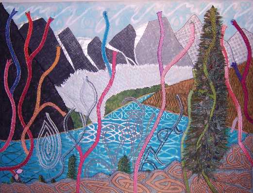
Canada: Harmony vs. the People:
A move towards Celtic Impressionism whereby each element is defined by its own Celtic core pattern.
The soaring harmony of the Canadian Rockies, with their unbelievably turquoise lakes, is sadly not echoed in Canada’s
people, owing to the erosion of their collective unconscious over time. As a 2002 article in The New York Times
indicated, Canadian achievers tend to be born abroad, and the substantial vitality needed to succeed and be recognised
in the larger pool of the international arena, comes from immigrants/ 1st-generation Canadians. Exceptions have
usually been educated/trained abroad.
In this piece, incoming immigrant energy is depicted in solid shades of red or green. By contrast, the energy of the
established population (2nd generation and above) seems attractive and purposeful, but is insubstantial, grey and
meandering, rarely arriving anywhere.